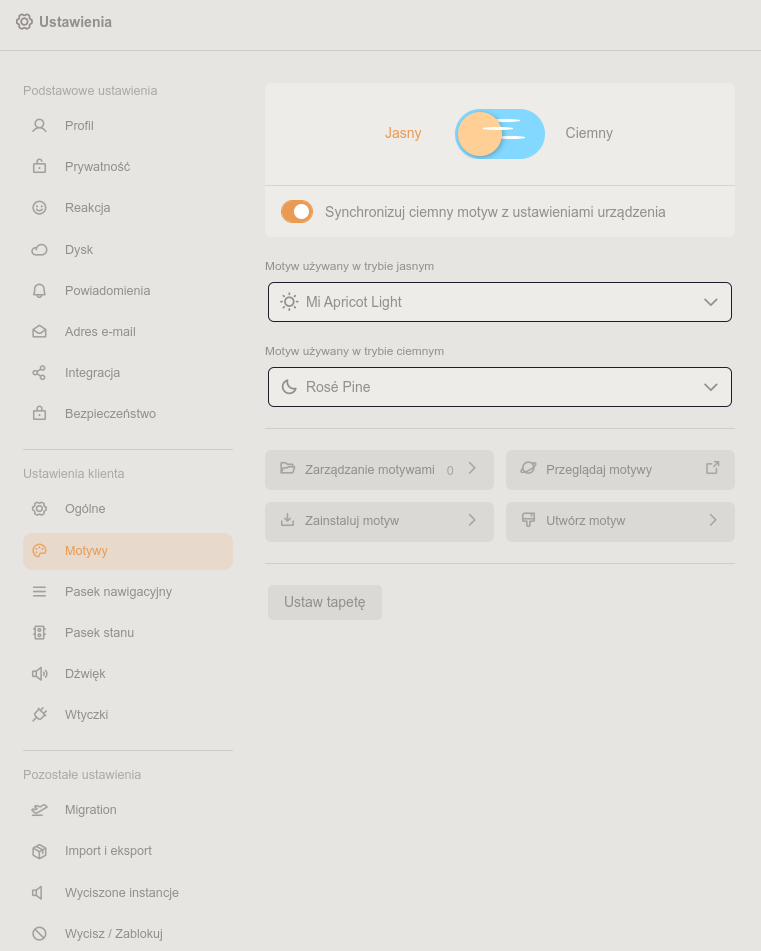
@cleo yes, and yall have a shitton of inconsistencies, like, why is there a separate quote button while renote still shows a dropdown after clicking, or why do you need a separate favourite button, or why is light theme unreadable
@cleo the default one is unreadable for me, icons just add to that unreadability because they all look like something pulled out straight out of google's office
@cleo@thatonecalculator now i will say also whats so disturbing me about default light theme, this dark blue text on peach background is hard for me to read really
@cleo@thatonecalculator default misskey themes aren't better in that regard anyway, one is straight up just light grey text on dark grey bg, like wtf syuilo